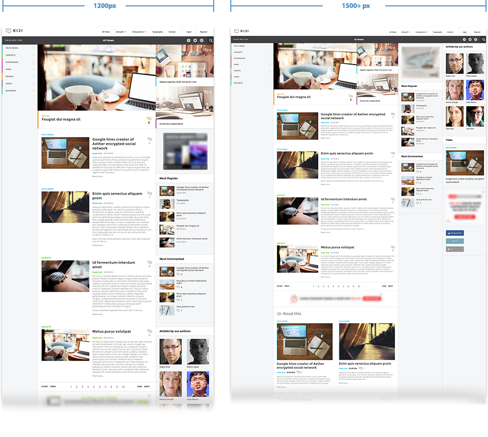
The grid-based responsive layout adjusts automatically depending on your visitor’s screen size so that your content displays beautifully on mobile devices, tablets and large desktop monitors. Take note, it's not your average responsive website ;)
Due to its advanced layout and content features, Kiji is exclusively built for K2 (the popular content management extension for Joomla), but generic styling is -as always- offered for every Joomla extension.
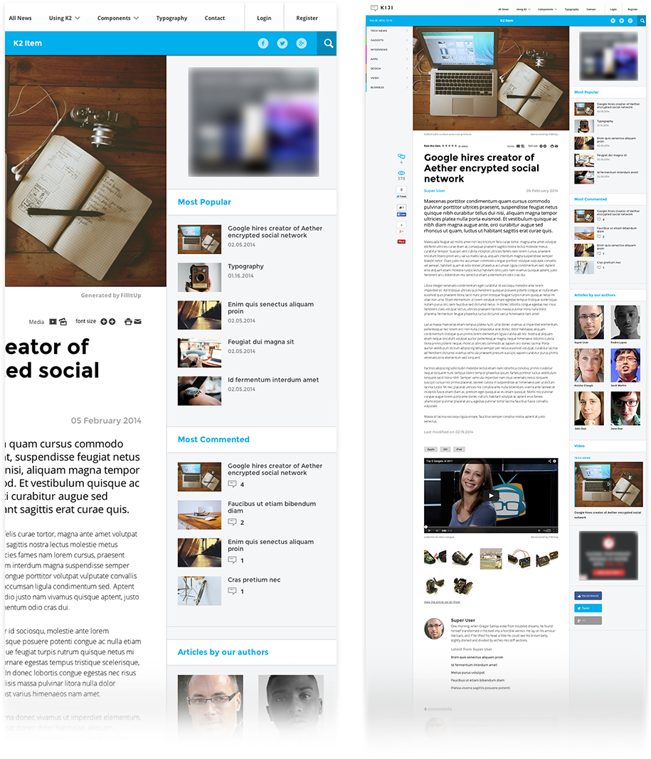
Optimized for your content
Kiji is a truly versatile and feature-rich template for content heavy websites such as news portals and magazines and it's optimized for both site performance and browsing flexibility for your visitors.
Mobile and tablet friendly design

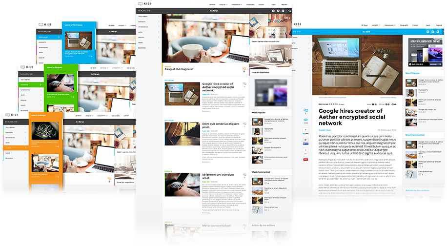
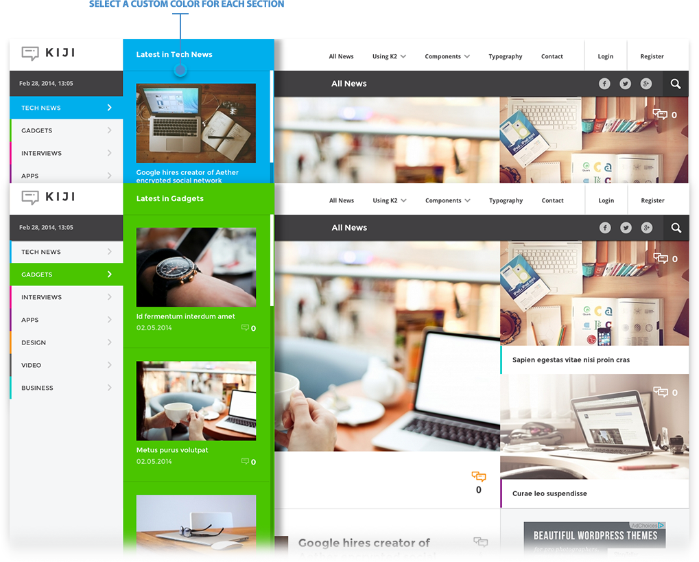
Customisable mega menu for each section
Smart layout that adapts beautifully on every screen size
Not your average Joe's responsive website.
Built for K2
Kiji is built exclusively for K2, the popular award-winning content management extension for Joomla, which provides you with flexibility and unique functionality that adapts to any site's needs.