- Posts: 4
COMMUNITY FORUM
Large padding on mobile/tablet view
- Dennis Stollman
-
Topic Author
- Offline
- New Member
Less
More
5 years 7 months ago #173150
by Dennis Stollman
Large padding on mobile/tablet view was created by Dennis Stollman
Hi!
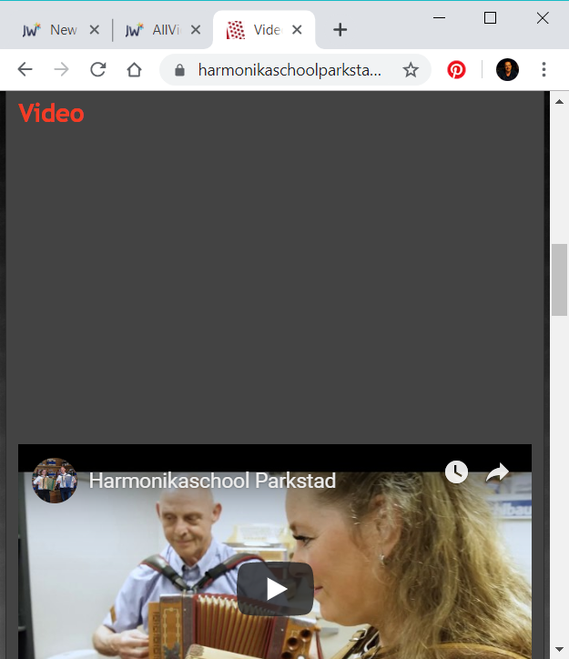
With the responsive template in use of AllVideos, my videos show correctly when viewed on a laptop screen. You can see the website in progress here: www.harmonikaschoolparkstad.nl/test/index.php/nl-NL/media-sub/video .
But when this website is viewed on a mobile or tablet, then a large padding or margin on top for youtube is added. You can reproduce this very simple by decreasing the window size of your internet explorer program (I tested on Chrome and IE. Or use the Chrome developer tool offered).
I looked at the template.css file and found the 58% padding, but when I set this to 0, then it looks alright on mobile, but the videos are not visible in normal / laptop view.
Do you have any solution for this?
Thank you in advance.
Kind regards,
Dennis
Please Log in or Create an account to join the conversation.
- JoomlaWorks
-
- Offline
- Admin

Less
More
- Posts: 6227
5 years 7 months ago #173154
by JoomlaWorks
Fotis / JoomlaWorks Support Team
---
Please search the forum before posting a new topic :)
Replied by JoomlaWorks on topic Large padding on mobile/tablet view
You're templating is injecting a <div> wrapper around the <iframe> produced by AllVideos.
jmp.sh/MtB6aYe
This is what adds additional padding to AllVideos existing padding-for-responsive technique.
It may be an option in the template's parameters to disable.
jmp.sh/MtB6aYe
This is what adds additional padding to AllVideos existing padding-for-responsive technique.
It may be an option in the template's parameters to disable.
Fotis / JoomlaWorks Support Team
---
Please search the forum before posting a new topic :)
Please Log in or Create an account to join the conversation.
- Dennis Stollman
-
- Offline
- New Member
Less
More
- Posts: 4
5 years 7 months ago #173156
by Dennis Stollman
Replied by Dennis Stollman on topic Large padding on mobile/tablet view
Thank you for your quick reply.
Is the div nit inserted inside the av block. At least that is what I see in the screenshot. Maybe you mean another div section.
If it is not allvideos, than I have no clue on how to disable the div generation only in responsive mode. Do you have any more ideas?
Is the div nit inserted inside the av block. At least that is what I see in the screenshot. Maybe you mean another div section.
If it is not allvideos, than I have no clue on how to disable the div generation only in responsive mode. Do you have any more ideas?
Please Log in or Create an account to join the conversation.
- JoomlaWorks
-
- Offline
- Admin
Less
More
- Posts: 6227
5 years 7 months ago #173160
by JoomlaWorks
Fotis / JoomlaWorks Support Team
---
Please search the forum before posting a new topic :)
Replied by JoomlaWorks on topic Large padding on mobile/tablet view
The <div> is inserted dynamically by JS from the file: www.harmonikaschoolparkstad.nl/test/templates/harmonikaschool_parkstad_03/script.responsive.js
Locate the following block in that file:
...and change it to:
Locate the following block in that file:
jQuery(window).bind("responsive", function (event, responsiveDesign) {
    'use strict';
    responsiveCollages(responsiveDesign);
    responsiveImages(responsiveDesign);
    responsiveVideos(responsiveDesign);
});
...and change it to:
jQuery(window).bind("responsive", function (event, responsiveDesign) {
    'use strict';
    responsiveCollages(responsiveDesign);
    responsiveImages(responsiveDesign);
    //responsiveVideos(responsiveDesign); // Disable auto-responsive iframes
});
Fotis / JoomlaWorks Support Team
---
Please search the forum before posting a new topic :)
Please Log in or Create an account to join the conversation.
- Dennis Stollman
-
- Offline
- New Member
Less
More
- Posts: 4
5 years 7 months ago #173163
by Dennis Stollman
Replied by Dennis Stollman on topic Large padding on mobile/tablet view
Thank again for your reply.
This is great .support. I will test it when Im back at home and will let you know if it helped.
Regards, Dennis
This is great .support. I will test it when Im back at home and will let you know if it helped.
Regards, Dennis
Please Log in or Create an account to join the conversation.
- Dennis Stollman
-
- Offline
- New Member
Less
More
- Posts: 4
5 years 7 months ago #173171
by Dennis Stollman
Replied by Dennis Stollman on topic Large padding on mobile/tablet view
Yes, I worked like a charm. Thank again for your help. It's really apppreciated.
Regards, Dennis
Regards, Dennis
Please Log in or Create an account to join the conversation.
- JoomlaWorks
-
- Offline
- Admin
Less
More
- Posts: 6227
5 years 6 months ago #173200
by JoomlaWorks
Fotis / JoomlaWorks Support Team
---
Please search the forum before posting a new topic :)
Replied by JoomlaWorks on topic Large padding on mobile/tablet view
You're welcome Dennis.
Fotis / JoomlaWorks Support Team
---
Please search the forum before posting a new topic :)
Please Log in or Create an account to join the conversation.