COMMUNITY FORUM
Layout problems: Chrome Vs. Firefox
- Saulius
-
Topic Author
- Offline
- Junior Member
Less
More
14 years 1 month ago #62993
by Saulius
Layout problems: Chrome Vs. Firefox was created by Saulius
Hello everyone @ K2,
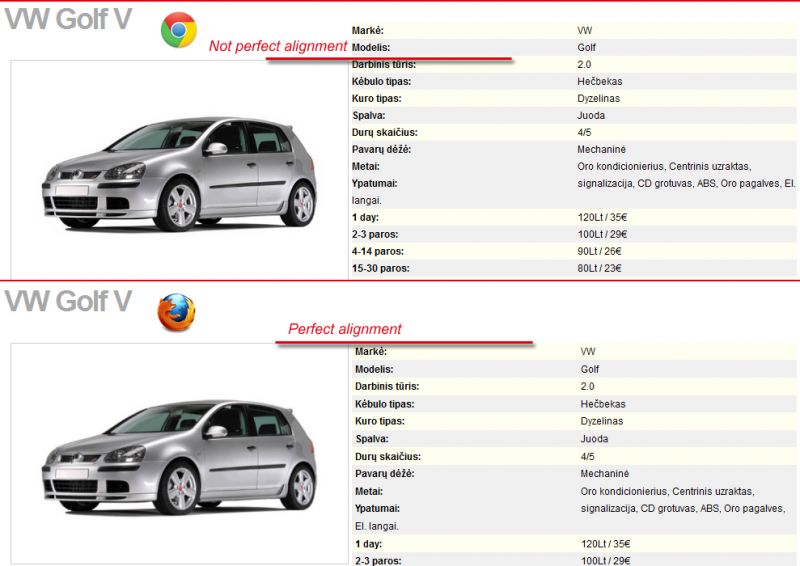
I have recently launched a car-renting site www.iseta.lt which I built using K2. It's not the first time I'm using K2 to help my ideas come to life and it seems that till now everything worked fine. The thing is that if you go to homepage www.iseta.lt, click on one of the autos which brings you to the K2 item (the auto info itself) page. You can simply click here iseta.lt/lt/component/k2/item/15-vwgolf.html. Now, as I'm using Firefox + Firebug for site development the layout of this page looks pretty good in Firefox (by that I mean the alignment between top of picture and top of extra fields are all in the same line). But it looks completely different in Chrome where the top of picture is not aligned with top of extra fields. And I can't find the problem in CSS. Whay is this thing happening and do I need to use some css hacking whatsoever...? I'm really lost here and would appreciate your help. You can see what I mean in the attached picture.
Looking forward to your replies :dry:
Please Log in or Create an account to join the conversation.
- Aaron
-
- Offline
- Premium Member
14 years 1 month ago #62994
by Aaron
Aaron :)
Replied by Aaron on topic Re: Layout problems: Chrome Vs. Firefox
What are you using for alignment? CSS? Can you share?
Aaron :)
Please Log in or Create an account to join the conversation.
- william white
-
- Offline
- Platinum Member
Less
More
- Posts: 3722
14 years 1 month ago #62995
by william white
Replied by william white on topic Re: Layout problems: Chrome Vs. Firefox
When i look at it in firefox, the image and extrafields are not exactly aligned. Try messing with k2.css line 189 padding setting and see if that make a difference in chrome as well
Please Log in or Create an account to join the conversation.
- Saulius
-
Topic Author
- Offline
- Junior Member
14 years 1 month ago #62996
by Saulius
Replied by Saulius on topic Re: Layout problems: Chrome Vs. Firefox
My dear friend William,
I think that's the problem - when I set the padding in Firefox it affects padding in Chrome, but still the image and extra fields are not correctly aligned. If you notice I have set the margin-top to -1087px. It seems that Chrome and Firefox treats the top of page differently. The same margin-top value in Chrome displays Extra fields a bit higher than it does in Firefox. In order to have this custom layout (extra fields to right of image) I manually customized K2.css file and although left and right padding/margin seems to work just fine, the TOP margin function doesn't.
I'm lost here.... :dry:
Please Log in or Create an account to join the conversation.
- Saulius
-
Topic Author
- Offline
- Junior Member
14 years 1 month ago #62997
by Saulius
Replied by Saulius on topic Re: Layout problems: Chrome Vs. Firefox
My friends,
I found a solution!!! :woohoo: I found it here amitavroy.com/justread/content/articles/css-hackfix-google-chrome-and-safari. So after reading this I just put
@media screen and (-webkit-min-device-pixel-ratio:0) {
div.itemExtraFields {
margin-top: -1041px; /* This works only in Safari and Google Chrome */
}
}
in K2.css and that fixed the problem! ;) Now everything looks as it is suppose to look in Firefox and Chrome (and Safari I suppose).
Please Log in or Create an account to join the conversation.

