- Posts: 4
COMMUNITY FORUM
This looks so weird....
- Joseph Jang
-
Topic Author
- Offline
- New Member
Less
More
15 years 7 months ago #73221
by Joseph Jang
This looks so weird.... was created by Joseph Jang
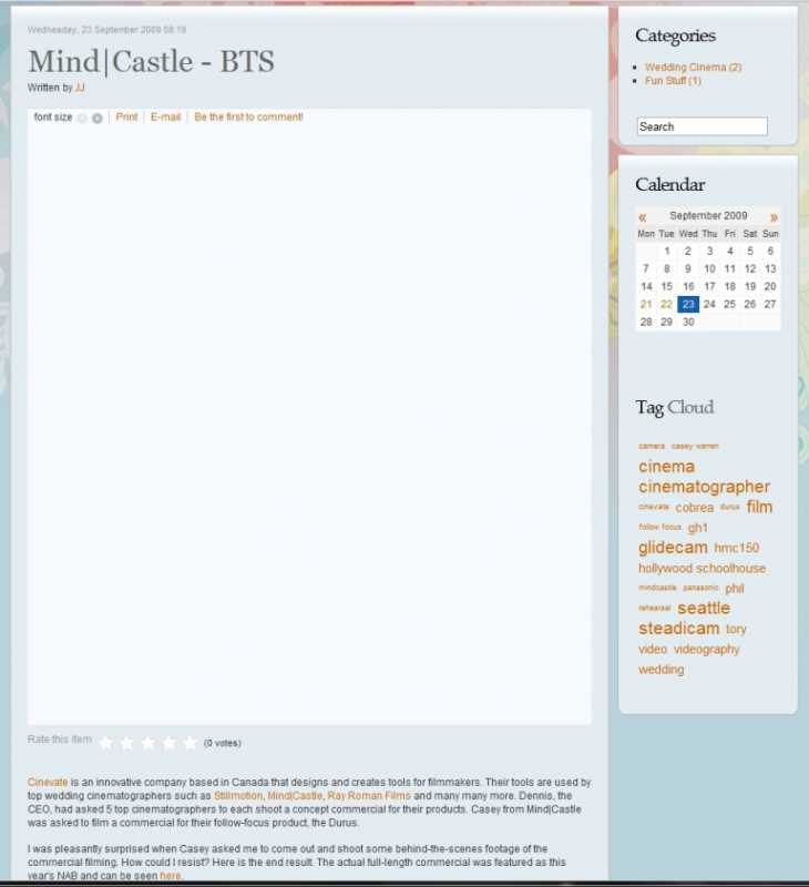
Hi guys. So I've almost got this to what I want but I can't figure out what is wrong with this layout. On my blog, if I click on an item to go to it's own page, there is a huge gap between the title and the actual content. This occurs only when the modules on the right side (categories, calendar, etc.) are enabled. When they are disabled, there is no space. Is this a template incompatibility issue with K2 or is there something I can do about it? Please help!!
Please Log in or Create an account to join the conversation.
- olsen
-
- Offline
- Elite Member
- Joomla and K2 Freelancer
15 years 7 months ago #73222
by olsen
Didn't solve your issues?? Why dont you consider hire me? Email me or contact me www.xevedigital.com for details
Replied by olsen on topic This looks so weird....
wich template are you using??? I have similar trouble with some specific positions on RT templates. Anyway, you can fix temporarily given height value at div.itemtoolbar under style.css. This works in fixed height div, but not on div which change height depending on content.
Didn't solve your issues?? Why dont you consider hire me? Email me or contact me www.xevedigital.com for details
Please Log in or Create an account to join the conversation.
- Joseph Jang
-
Topic Author
- Offline
- New Member
Less
More
- Posts: 4
15 years 7 months ago #73223
by Joseph Jang
Replied by Joseph Jang on topic This looks so weird....
thanks for the reply olsen. i'm using the rockettheme replicant v2 template. i'll try the css fix to see if that works in the meantime. i appreciate the reply.
olsen said:wich template are you using??? I have similar trouble with some specific positions on RT templates. Anyway, you can fix temporarily given height value at div.itemtoolbar under style.css. This works in fixed height div, but not on div which change height depending on content.
olsen said:wich template are you using??? I have similar trouble with some specific positions on RT templates. Anyway, you can fix temporarily given height value at div.itemtoolbar under style.css. This works in fixed height div, but not on div which change height depending on content.
Please Log in or Create an account to join the conversation.
- Joseph Jang
-
Topic Author
- Offline
- New Member
Less
More
- Posts: 4
15 years 7 months ago #73224
by Joseph Jang
Replied by Joseph Jang on topic This looks so weird....
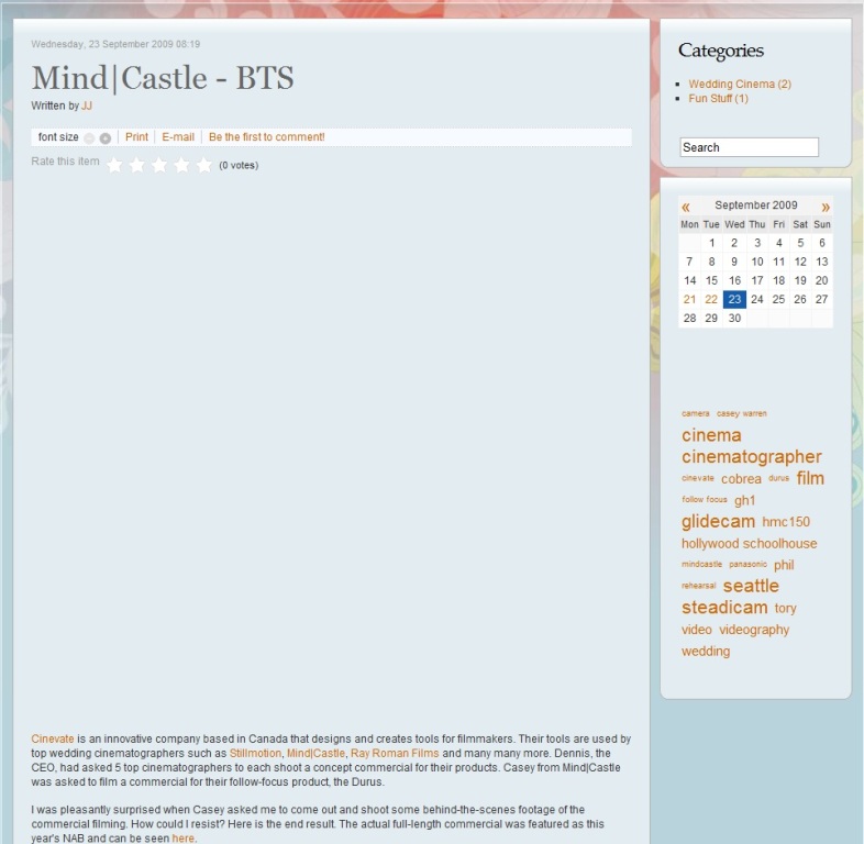
ok so i went into the css and adjusted the height of the div.itemtoolbar. it worked, but not really. see the screenshot. the size of the toolbar is right but there's still a big space. i do think that somehow the modules in the right are conflicting with the items. any suggestions? any fixes? please help! bah!! -_-
olsen said:wich template are you using??? I have similar trouble with some specific positions on RT templates. Anyway, you can fix temporarily given height value at div.itemtoolbar under style.css. This works in fixed height div, but not on div which change height depending on content.
olsen said:wich template are you using??? I have similar trouble with some specific positions on RT templates. Anyway, you can fix temporarily given height value at div.itemtoolbar under style.css. This works in fixed height div, but not on div which change height depending on content.
Please Log in or Create an account to join the conversation.
- olsen
-
- Offline
- Elite Member
- Joomla and K2 Freelancer
15 years 7 months ago #73225
by olsen
Didn't solve your issues?? Why dont you consider hire me? Email me or contact me www.xevedigital.com for details
Replied by olsen on topic This looks so weird....
Now what it is under conflict is the rating div. you can adjust div.itemRatingBlock at the same way. I am not sure whats wrong but i think its with css "float" feature, and browsers dont get displayed well. RT templates are very complex at css level.
It works well to me modules at right position but if i publish some modules at inset position this trouble appear.
Also its very strange if i use IE Tab complement for firefox get right layout image, but not displayed well under proper IE.
mystery!!!
It works well to me modules at right position but if i publish some modules at inset position this trouble appear.
Also its very strange if i use IE Tab complement for firefox get right layout image, but not displayed well under proper IE.
mystery!!!
Didn't solve your issues?? Why dont you consider hire me? Email me or contact me www.xevedigital.com for details
Please Log in or Create an account to join the conversation.
- Joseph Jang
-
Topic Author
- Offline
- New Member
Less
More
- Posts: 4
15 years 7 months ago #73226
by Joseph Jang
Replied by Joseph Jang on topic This looks so weird....
thanks owen. i got that fixed too. and you're right..this does seem to be a RT problem. although, i used a different RT and there was no issue but this particular template has problems. it's not perfect but for now, i think it's good enough. thanks so much for your responses and assistance owen! much much appreciated.
olsen said:Now what it is under conflict is the rating div. you can adjust div.itemRatingBlock at the same way. I am not sure whats wrong but i think its with css "float" feature, and browsers dont get displayed well. RT templates are very complex at css level. It works well to me modules at right position but if i publish some modules at inset position this trouble appear.
Also its very strange if i use IE Tab complement for firefox get right layout image, but not displayed well under proper IE.
mystery!!!
Please Log in or Create an account to join the conversation.

