
In these 10 years we have managed to create some of the most respected and of course popular extensions in the Joomla community. Extensions like K2, AllVideos, Simple Image Gallery (Free and Pro) or Tabs & Sliders, all with more than one million downloads each. At the same time, we have developed more than 30 extensions for Joomla (both free and commercial), all with a combined download count of nearly 8 million.
As we progress into the future, building new & more complex products, while embracing new platforms (WordPress in particular), we must be laser focused on the products that matter most to our vision. And our vision is to offer solid, cross-platform products with a long lifespan, that redefine how we develop websites with Joomla and eventually WordPress. That way you can invest in them and know that they will be supported and improved continuously.
So as we move towards more such complex products, we (unfortunately) have to cut down on the resources we spend on extensions that are less important to us, as we really don't wish to become "Jack of all trades, master of none".
Our goal is to maintain a portfolio of less than 10 products for Joomla and (eventually) WordPress. Less products means we can be more agile when it comes to developing new features in the future.

K2 is built as a solid component and we don't plan on releasing updates every couple of weeks. To give you an idea of how solid K2 is, the previous version (2.6.9) was released in December 2014 and it was 100% compatible with Joomla 3.4.x up until the launch of K2 v2.7.0. A slower release cycle means we are more careful when we issue updates to K2 and this is something we believe firmly.
That being said, if we want to properly support third party extension integration with K2, it's best to decouple any such functionality. It's what we did since the inception of K2 in 2009 when we decided to keep the advanced media and image gallery functionalities completely separate in the form of AllVideos and Simple Image Gallery Pro.
After so many years, one thing has also proved certain: the continuous support of sh404SEF from Anything Digital and recently from Weeblr (founded by sh404SEF's original developer, Yannick Gaultier). sh404SEF is one of the most popular extensions in the Joomla community and it's arguably the best SEO related extension for Joomla.
So seeing sh404SEF continuously being updated and improved, we decided to decouple it from K2 in order to follow such changes in sh404SEF's development. As a bonus we also added community requested features for even better URL manipulation and finally we made sure the plugin supports both K2 versions 2.x and the upcoming 3.x. That's one codebase to maintain and from now on it will fall to faster updates, following closely the development of sh404SEF.
The new "K2 Plugin for sh404SEF" is distributed commercially for two reasons: we can provide dedicated/personal support and it's a way to give back to the K2 project.
"K2 Plugin for sh404SEF" is now available to purchase in 6 and 12 month subscriptions, starting from 14.90 EUR.

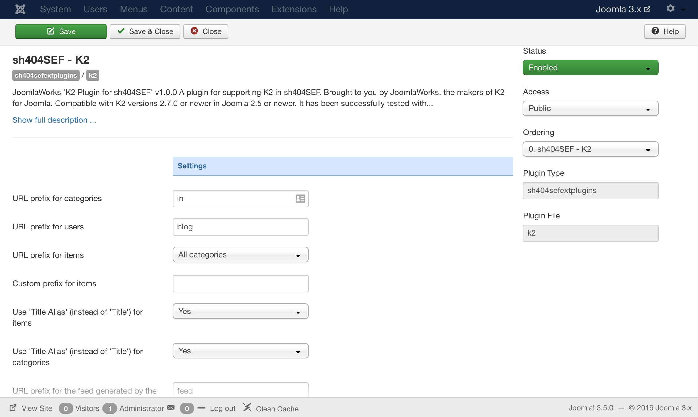
A plugin for supporting K2 in sh404SEF.
Use the plugin to configure K2 URLs when using sh404SEF in a multitude of options.
Unlike the previous built-in implementation for sh404SEF, this new plugin provides new URL manipulation options and it has dual compatibility with K2 versions 2.7.0+ as well as the upcoming K2 version 3.
The plugin has been successfully tested with sh404SEF versions 4.6.x in Joomla 2.5 and 3.x.
Requirements
- K2 v2.7.0 or newer
- sh404SEF v4.6.x or newer
- Joomla 2.5 or 3.x
Installation
- Make sure you meet the requirements above and that K2 and sh404SEF are already present on your Joomla installation.
- Upload the latest version of the plugin on your Joomla site.
- Locate the plugin under the "sh404SEF ext plugins" group in the Joomla Plugin Manager.
- Click the plugin name to edit its settings - most options are pretty self explanatory.
- Make sure the plugin is enabled and hit "Save & Close" after you adjust settings as you see fit.
- Clean your sh404SEF URLs cache.
- Clean Joomla's cache if it's enabled.
- K2 URLs should now be optimized by sh404SEF.
Screenshots

What a blast, both my first overseas trip and my fist international conference as well. This huge opportunity was not to be wasted.

Janaro is a flexible, zone based, multi-variation and fully responsive Joomla template, built for a wide range of websites, from corporate/business presentations to content-heavy movie, film or food portals that usually display high resolution imagery.

Setting up our Demo
As you can see the template offers three different homepages. On uses modules, K2 content modules and one uses the component view. Since there are 4 different K2 templates you can create numerous variations of these pages.
The Front-page and module positions
The template positions of this template offer a quick and efficient setup.
You have the Hero position where you can setup the Featured or the slideshow module. The nuJanaro_AboveContent, nuJanaro_Content and the nuJanaro_BellowContent positions which you can publish full width modules like the Editorial and also a sidebar nuJanaro_Right.
Finally there are the nuJanaro_Breadcrumbs, nuJanaro_Search and two positions for the menu.
Template functionality
From the template’s settings view apart from the colours, you can also control most of the template’s functionality.
- Select your site’s width
- Choose between three predefined home templates
- Choose between three template variations
- Use your own colour variations or use one of the ten predefined ones
- Enter your social links
- Select the main text and header font.
- Upload three different logos
All these settings are located in template’s parameters.
Template and color variations
Apart from the ten predefined colour variations in the quick start packages we have included three template variations based on our color and font variations to suit your content’s needs.
The default template - which is ideal for a cinema/ movie based content.
The Music variation - which uses a darker palette is excellent for music/ art related content.
The Food variation - which used serif fonts and a lighter palette making it ideal for cooking sites.
Using the template of your choice
Once you download the quick start Go to Extensions -> Template Manager and select the template you want as default.
Not using the quick start package, no worries.
- The musicmad template uses the following settings:
- 1500 pixels for site width
- Dark Yellow color variation
- The Gentium Basic font for text
- The Alfa Slab font for headers and the smaller font size settings for the headers
The cooxmad (food variation) uses the following settings:
- 1500 pixels for site width
- Light Turquoise color variation
- The Quattrocento font for text
- The Playfair Display for headers and the smaller font size settings for the headers
Choosing between horizontal and fly-out menus
The template has two different menu styles. The only thing you need to do for choosing is to publish your menu in the nuJanaro_Horizontal_Menu position for a horizontal menu and the nuJanaro_Menu for a flyout menu. It is advised not to use both menus at the same time.
Choosing the right logo for your site
The template offers the ability to upload multiple logos. The standard one and two variations of it.
You have the option to use an inverted logo that appears over the Hero section. This logo will be visible only if the Featured module is published.
The other option you have is to use a smaller logo for your K2 items. This smaller logo will appear over the main image on the top right corner of the site.
If a variation is not present the default logo will be used in all views.
Using a text logo
Don’t want to use an image, we’ve got you covered. You can use a text logo and you do not have to worry about the color. The template will determine the color of the picture and it will assign the logo automatically a lighter color if is needed.
Image Placeholders
This template uses a placeholder image. If you want to change the placeholder simply replace the image at: /templates/janaro/images/placeholder.png
K2 sub-templates and categories
Default template.
The default template can be seen by clicking on the Using K2 link. It is better suited for news listings.
Movies template.
This is a category template specially built for your movie or special item listings.
Grid template.
This template is self-explanatory. This is a template for your grid listings.
Item templates.
There are three specific templates for items that full utilise the power of K2.
The box office, the top10 and the poster (check the demo where both template are being used).
The box office template is used for producing a box office inside your item while the poster template is specifically designed to accomodate vertical (portrait images) eg. Movie Posters. Finally the Top 10 template is used for producing your top 10 charts.
Depending on the number of columns and the presence of a sidebar, you can choose the appropriate image size.
If you have a sidebar present or you are using multiple columns for your layout you may choose the medium image size.
Otherwise you can use the Large size.
K2 Extrafields
This template uses K2 to its fullest extent. The extrafields are use to produce a truly fully functional movie oriented portal.
With these extra fields you can:
- Display Additional Movie details such as cast, director producer, the poster image, etc.
- Display a top - 20 Box Office either as a module or within the K2 item.
- Display reviews, with an avatar and a link to the source.
- Display a Top 10 chart
- Display Ingredients, cooking time and recipe related info
- Display release info and rating about a music album
The extra fields are separated to five different groups.
- The box office which is used for the top - 20
- The movie details
- Music Fields
- Recipe fields
- Top - 10 which are used for creating Top - 10 charts.
You are free to change the labels of the extra fields but the aliases should remain unchanged because they are rendered directly in the template.
K2 Content module templates
- BoxOffice - for presenting the latest Box Office
- Top - for creating top 10 listings
- Default - the module’s default template
- Editorial - the module placed under the Hero section
- Featured - the module that is used on the Hero section
- Frontpage modue - it produces a category like layout so it can be used instead of the component.
- Frontpage3Cols - a columned variation of this module which is published on the frontpage
- Masonry - a module that uses the famous Masonry script. It is similar to the feeds on the homepage but uses K2 Content instead
- Slideshow - the slideshow module without the week on top
- SlideshowWeek - the slideshow with the week on the heading
- VideoSlider - a Video Player module
Additional Module Settings.
Two modules need specific module suffixes in order to have the exact look and feel as in the demo.
The leaderboard banners need the “bannerArea" suffix.
The Editorial needs the “modEditorial innerWrap" banner suffixes.
Additional Modules/ Extensions
You might have noticed the feeds present in the homepage of the demo. You may also use a K2Content module with the same look and feel if you want to show your content, or if you want to use RSS feeds you need the “Simple RSS Feed Reader" extension - https://www.joomlaworks.net/extensions/free/simple-rss-feed-reader.
Once you install it and set up your module all you need to do is to choose the default template.
Additional Components
Apart from the K2 component we offer CSS styling for the following components
com_contact (form only)
com_users ( all views )
com_search
com_weblinks
com_newsfeeds
com_tags
Commercial Extensions
Simple Image Gallery Pro - After installing it go to the Extension's parameters Layout template for image galleries and choose the one named after the template, i.e. matchbox and matchbox_module.
nuContent - nuContent is a premium Joomla extension, exclusive only to JoomlaWorks members, which extends the default Joomla article system with presentation features that match the flexibility of K2 (in case you don't want to use K2). Setup instructions are located here: http://nuevvo.com/downloads/commercial-extensions/item/24-nucontent
Module positions
- nuJanaro_Menu
- nuJanaro_Horizontal_Menu
- nuJanaro_Search
- nuJanaro_Breadcrumbs
- nuJanaro_Hero
- nuJanaro_AboveContent
- nuJanaro_BellowContent
- nuJanaro_Content
- nuJanaro_Right
- Image Sizes
The following image sizes are recommended for this template:
- XSmall 100
- Small 200
- Medium 400
- Large 600
- XLarge 1280+
- Generic 900
- Category Image 100
- Avatar Size 100
- Commenter Image 48
Module Suffixes
- left adds a float:left to a block.
- right adds a float:right to a block.
- text-center adds a center alignment to a block.
- text-right adds a right text alignment to a block.
- text-left adds a left text alignment to a block.
- modEditorial innerWrap are used for the Editorial template
- bannerArea is used for the leaderboard banners
For developers and enthusiasts
Icon Fonts
We have included the Entypo family from fontello.com as well as the Simple Line icon Family.
Glyph guides can be found at fontello.com and http://graphicburger.com/simple-line-icons-webfont/
Animations
You can easily create your own animations using using using natural, declarative language:
<!-- Reveal using custom parameters -->
<div data-scroll-reveal="enter left and move 50px over 1.33s">Foo</div>
<div data-scroll-reveal="enter from the bottom after 1s">Bar</div>
<div data-scroll-reveal="wait 2.5s and then ease-in-out 100px">Baz</div>
More information can be found at http://scrollrevealjs.org/ and https://github.com/julianlloyd/scrollReveal.js
ExtraFields
You can render directly extrafields in your K2 template. You can find a cheat sheet here which you can use the template’s vast collection of fields, or use it as a base to develop entirely new sets of extra fields.
The Grid
We are using ZURB's foundation grid for this template. You can find out more about foundation here: http://foundation.zurb.com/
Addtionally we have added a grid for larger (xl) and very large (xxl) viewports.
Block Grid
We have included Foundation's block grid.
More info can be found here. http://foundation.zurb.com/docs/components/block-grid.html
Visibility Classes
If you need complete control over your modules in responsive states we 've got you covered. This template uses the power of the The most advanced responsive front-end framework in the world, ZURB's foundation.
All these classes are located in the template.css and can be easily expanded and/or edited and can be used for every block of your template, not just your modules.
More info can be found here: http://foundation.zurb.com/docs/components/visibility.html
Visual Walkthrough


https://www.joomlaworks.net/blog/itemlist/date/2011?start=50#sigProIdb14138d9fa
This is the privacy policy for the Google and Facebook Apps named "joomlaworks.net" (referenced as the "Apps" below).
As a registered Google and/or Facebook user, you are also subject to Google's and/or Facebook's privacy policy. For Facebook specifically, please check your Facebook account privacy settings for further information.
Collecting information about you
We only collect your name and email address to allow you access to our website. No other information is retrieved from your account.
Our principles
We never share any information we collect (as stated above) with any other source or company.
Unsubscribing
To unsubscribe simply remove the App by accessing the application settings in your Google and/or Facebook account settings. Once you remove the App you will no longer be able to login to our website.

Setting up our Demo
This template offers multiple layouts for item listings as you can see in the demo site.
It also offers two different K2 templates, one used for the front page and one for the inner pages.
For the home page (where we have a three column layout) we use the front-page K2 template for the item listings.
The Front-page
If you have already downloaded and installed the quick-start package you will notice all the settings are inherited from the categories.
For the front-page we use one column for our leading items and the Large image, two columns and two primary items which use the small image, and two secondary items in a single column layout which also use the small sized images. Finally we have a plain list of four link items in a single column with no images.
The main difference in the K2 templates you will receive lies into the category_item.php files. As you can see from the demo we are using different elements in our leading items and we choose to hide the Item rating, times read, tags, time created and extra fields in the rest of our items. To achieve this we created a different and distinct instance of category_item.php for the leading items called category_item_leading.php. The default category_item.php (used for the rest of the items) does not include the aforementioned elements (Item rating, times read etc). If you choose to override these settings you have plenty of available options.
- Use the default K2 template
- Use only leading items
- Use the category_item_leading in all item groups ( a simple edit in category.php is needed for this )
- Blog Layout
For the blog layout (blog category not user blog) we simply use eight leading items in a single column and the XL images.
Magazine Layout
For this view we are using the settings found in the Default Item Listings category. We are using the same layout as the index page one column for the leading and the secondary items and two for the primary items. The only significant change is that we are using larger image sizes. (XLarge for leading, Medium for Primary and Small for the secondary items ).
Catalog Layout - Parent Category
This view inherits its settings from the Default Catalog Parent category. It is ideal for a catalog/e-commerce site where you need to list all of your subcategories and not your items.
This view has (0) zero items for all of its groups and has the Sub-category blocks visible.
Catalog Layout - Children Categories
The catalog listing view used in our demo uses a two columned layout for each of the item groups and no (0) links. The ideal image size for this layout is the medium one.
The settings can be found Default Catalog Listing category in the quick start package.
Please note that this layout requires the catalog mode to be enabled in order to function properly.
Menus
From the demo site you can see this template offers vertical menus. This template also offers horizontal menus.
All you need to do is use the horizontal-menu as your module suffix.
Please note that you have to enter one module suffix in your menu module instances.
Image Sizes
The following image sizes are recommended for this template:
- XSmall 100
- Small 210
- Medium 320
- Large 480
- XLarge 670
- Generic 310
- Category Image 194
- Avatar Size 200
- Commenter Image 48
Module Suffixes
- .floatLeft adds a float:left to a block.
- .floatRight adds a float:right to a block.
- .textCenter adds a center alignment to a block.
- .textRight adds a right text alignment to a block.
- .textLeft adds a left text alignment to a block.
- .sideModule Use this module class to any new modules in your sidebar
Visibility Classes
If you need complete control over your modules in responsive states we 've got you covered. This template uses the power of the The most advanced responsive
front-end framework in the world, ZURB's foundation.
.hide-for-small Hides the module in viewports bellow 767px
.show-for-small Shows the module in viewports bellow 767px
.hide-for-medium Hides the module in viewports above 768px and bellow 1279px
.hide-for-medium-up Hides the module in viewports above 768px
.show-for-medium Shows the module in viewports above 768px and bellow 1279px
.show-for-medium-up Shows the module in viewports above 768px
.show-for-medium-down Shows the module in viewports bellow 1279px
.show-for-large Shows the module in viewports above 1280px and bellow 1440px
.show-for-large-up Shows the module in viewports above 1280px
.hide-for-large Hides the module in viewports above 1280px and bellow 1440px
.hide-for-large-up Hides the module in viewports above 1280px
.show-for-xlarge Shows the module in viewports above 1440px
.hide-for-xlarge Hides the module in viewports above 1440px
.show-for-landscape Shows the module in the landscape orientation
.hide-for-landscape Hides the module in the landscape orientation
.show-for-portrait Shows the module in the portrait orientation
.hide-for-portrait Hides the module in the portrait orientation
All these classes are located in the template.css and can be easily expanded and/or edited and can be used for every block of your template, not just your modules.
Template Specific Module Overrides
In this template we are using overrides for all K2 modules and two for the K2 Content module.
Clean - to be used for a cleaner layout
Lists - to be used for item listings e.g. the Popular Blog Posts module located in the sidebar.
Extra Fields
For demonstration purposes we are using some extra fields displayed in regular K2 items.
You can see them here demo.getk2.org/item.
For catalog items we are using the variations extra fields group which contains the color. size and price variations.
Both groups are displayed using the same template and use the default loop in our item.php.
Color Variations
This template comes with nine (9) preset colour variations and the option to use your own custom colours.
Setting up the tabs
In the sidebar (right bar) you will notice in the demo the presence of a tabbed module.
These tabs are hardcoded in our template. All you need to do in order to get them working is to assign a module to these positions getK2-Tab1,2 and 3 and then naming the tabs.
After assigning the modules to those positions you will notice that the tab headers have not been changed. Due to the limited space and wanting to preserve a somehow logical module naming, the tab headers are NOT the module titles.
To name the tabs go to Extensions → Tempate Manager, locate your template, click on it, and name the tabs through the appropriate fields on the template parameters.
Block Grid
We have included foundation's block grid with some minor alterations and tweeks for modules like the category listings.
More info can be found here. http://foundation.zurb.com/docs/components/block-grid.html
Icon Fonts
We have included the Entypo family from fontello in this template. The stylesheet is embedded with the main template.css file.
Additional Components
Apart from the K2 component we offer CSS styling for the following components
- com_contact (form only)
- com_users ( all views )
- com_search
- com_weblinks
- com_newsfeeds
Commercial Extensions
Simple Image Gallery Pro - After installing it go to the Extension's parameters Layout template for image galleries and choose the one named after the template, i.e. takai.
Visual Walkthough


https://www.joomlaworks.net/blog/itemlist/date/2011?start=50#sigProId3a7b049b6f

This template comes with three different color variations. The Turquoise/Red which is the default, the Purple/Blue and the Green/Orange. You can choose the one you like through the template parameters under the option Select Color Variation in the Template Specific tab. You can also create your own color variation by choosing the colors for Custom color 1 and 2.
Setting up our demo
This template has two different layouts for listings.
The first category layout in use is the Default. It is used for the Blog category listing. For this list layout we need five Leading items with a Large image size.
The next category layout in use is based on the Default layout, but has different settings in order to show as a Grid. For this layout we need eight Primary items with Medium image size photos in two Columns. Another parameter that is very essential and cannot be ignored, is to give the page suffix gridView to the menu item pointing to that Grid category.
Image Sizes
The following image sizes are recommended for this template:
- XSmall 70
- Small 270
- Medium 560
- Large 770
- XLarge 900
- Generic 270
- Category Image 70
- Avatar Size 48
- Commenter Image 70
Module Suffixes
- .floatLeft, .fLeft adds a float:left to a block.
- .floatRight, .fRight adds a float:right to a block.
- .center, .text-center adds a center alignment to a block.
- .left, textLeft adds a left alignment to a block.
- .right, .textRight adds a right alignment to a block.
- .greyBox is used to show the module as a box with the #ececec background color.
- .box is used to show the module as a box with the #f8f8f8 background color.
Template Specific Module overrides
K2 Content Modules
- ImageOnly
- LatestBlogPosts
- Quotes
- Slider
- Slideshow
Extra fields
For better content management we have set up some Extra Fields that are associated with specific categories.
Let's start with the Quotes category. The Quotes category is associated with the Quotes K2 Content Module which is located in the Homepage of the Demo site, as well as in the inner pages, titled "What client's say?".
For this category we have set up an Extra Field Group called Quotes which includes one Extra Field, the Quoter Name. For the quote itself the introText is set up to show.
Another set of Extra Fields that is used for the Clients category is the Clients Group. This group includes the following fields: Image, Link. The image type extra field is used instead of the item image itself in order to provide some kind of freedom in the image sizes used. The link extra field is used in case the image wants to point to a specific webpage. This category is used for the Slider in the demo's Home page.
Use of page Heading
In the demo site, in all inner pages on the header, on the right there is a title. This title is the page heading and is located in the menu item under 'Page Display Options'.
Joomla Content Component
All K2 category layouts can also be applied to the Joomla Content Component. To set up the layouts for the Category Blog, the Leading items are used in a single column. The Grid uses eight intro items in a two column grid. This layout, like the K2 Grid layout, also needs the page suffix gridView.
Commercial Extensions
Simple Image Gallery Pro - After installing it go to the Extension's parameters Layout template for image galleries and choose the one named after the template, i.e. nuModusVersus.
Visual Walkthrough


https://www.joomlaworks.net/blog/itemlist/date/2011?start=50#sigProId8e92aac30f

Setting up our demo
This template has two different layouts for listings.
One for the frontpage and one for the category/categories.
For the frontpage grid layout we need:
- one Leading item with a Large image in a single column,
- two Primary items with Medium images in two columns,
- four Secondary items with Small images in four columns,
- four Link items with XSmall images in two columns.
The grid layout of the frontpage inherits its parameters from the menu item.
For the category listings we use six Primary items with Medium image size in a single column.
Image sizes
The following image sizes are recommended for this template:
- XSmall 100
- Small 178
- Medium 386
- Large 594
- XLarge 900
- Generic 386
- Category image 100
- Avatar size 100
- Commenter image 48
Module suffixes
This template uses the basic suffixes as described here.
Template specific module overrides
Apart from the Joomla Content, K2 Component and all its modules, we have one very specific K2 Content Module override, the Video gallery. You can use this if you want a video gallery like the one on the Demo site's frontpage.
Remember this is only available if you are using the K2 Component and not the default Joomla Content.
Commercial Extensions
Simple Image Gallery Pro - After installing it go to the Extension's parameters Layout template for image galleries and choose the one named after the template, i.e. nuMagazine.
Visual Walkthrough


https://www.joomlaworks.net/blog/itemlist/date/2011?start=50#sigProId787ca4a7e9